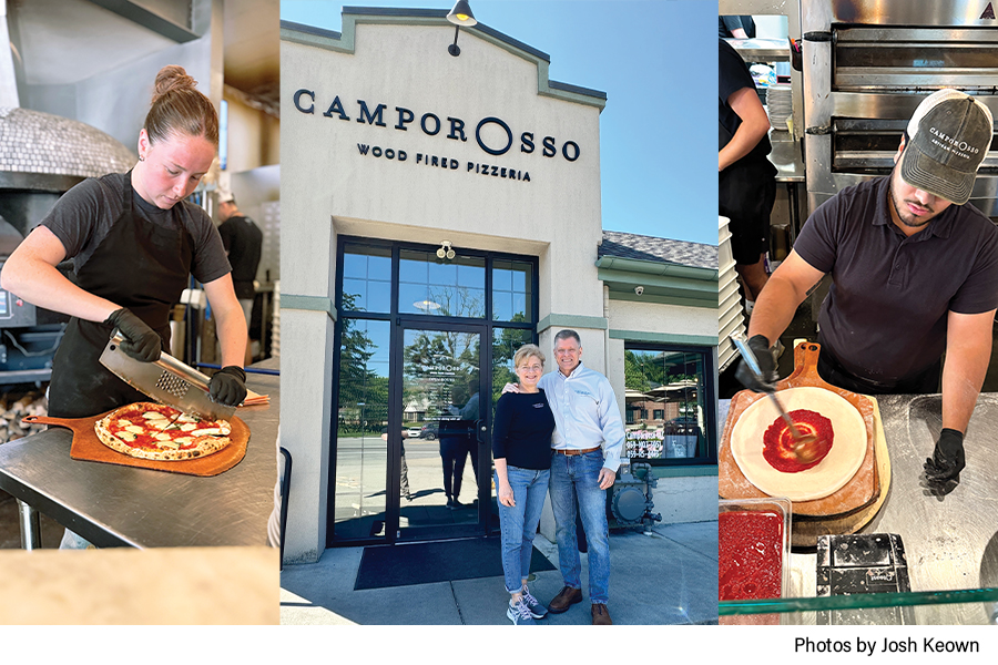
Standing out in a strip mall takes consideration
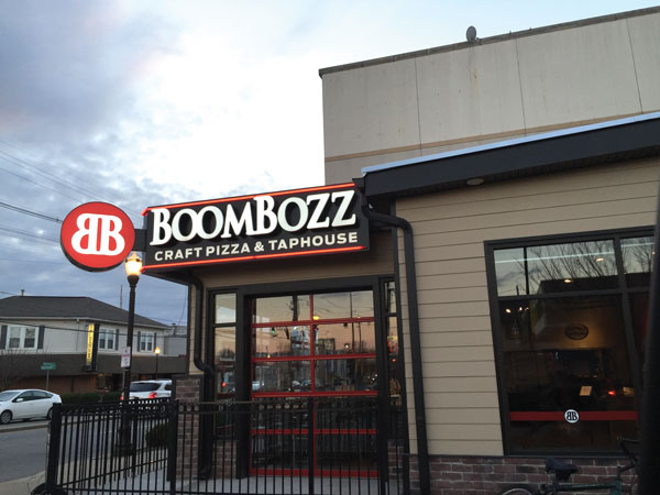
If you think the sign outside your pizzeria won’t make much of a difference in attracting customers, consider the success story of Greenville Avenue Pizza Company in Dallas, Texas.
The pizzeria decided to invest in neon signage –– not just at their store front entrance, but also at the rear, where a giant, red neon arrow bearing the word, “PIZZA,” points to the back door. The front door sign, though much smaller, also catches the eye on the busy thoroughfare. Owners Sammy and Molly Mandell went for modeling it after a historic sign on Greenville Avenue. People who have lived in Dallas for most of their lives recognize the design.
“Both signs have drawn so much attention and have really helped with our social media push,” Sammy says. “People pose next to it and say things like ‘I Found Heaven,’ or, ‘I Thought You’d Never Ask.’ Both our signs are also all over Instagram. They have been a hit!”
As a result, the Greenville Avenue neon signs have had a Pavlovian effect, becoming synonymous with images of mouth-watering pizza and triggering appetites, the Mandells say.
The Mandells have hit on important concepts when it comes to attracting attention with signage: personality, placement, concept and legibility. Here’s the breakdown on how to achieve all of them, with tips from Stacie Thompson, vice president at Upshot, a Chicago marketing agency whose client roster has included big names like Starbucks, Google, Subway and Hilton, among others.
Personality does matter. “It’s great to see restaurants taking more liberties with the way their brand shows up over the door in recent years,” Thompson says. “Restaurants are using their personality as a cue to how to sign, and we’ve seen a really creative use of space. Logos wrapping around a 90-degree corner on a building, stacking words vertically instead of horizontally, even embedding logos into the sidewalk out front for passersby.”
If you’re a hot modern new pizza spot, look to do something unexpected. “A rustic, hand burned sign out front conveys something different than a brightly lit neon or sophisticated pin-mounted, halo lit lettering,” she says.
For a more traditional family pizzeria, lean more heavily on the traditional Italian flag’s color palette, or use a serif font to telegraph who you are, Thompson says.
Restaurants also look at what worked decades ago and are reapplying it today, Thompson says. The Mandells’ front sign is a good example, harkening to one of the original Greenville Avenue Bar & Grill designs.
Your sign choices also actually send messages to customers, Thomson says. Sidewalk signs with hand-written, timely specials show a commitment to a push to keep the offering fresh and current. Chalkboard signs with limited time offerings help to drive repeat traffic and communicate urgency. “They are a great way to communicate with your guests about where ingredients are sourced or what a new Yelp or social media review says,” she says.
Next, think about placement. Consider visibility from all directions. Walk or drive the approach to your location before choosing the ideal spot.
“I’m always really amazed when the name of a restaurant is not closely positioned near (typically above) the location of the entrance. If your sign ends up in a spot that’s not intuitive to where you enter, make sure you add some additional signage near or on the doors,” Thompson says.
What if you’re in a strip mall, with tight restrictions on sign placement from your landlord? There are definitely smart ways to stand out, Thompson says. Start by looking at signage for adjacent stores and do something different with colors or unique shapes to attract more attention.
“Where restrictions don’t allow flexibility within these upper signs, think about supplementing your signage — like adding a custom neon in the window or using large vinyl letters or design on your glass storefront to attract attention,” she says.
A little less tangible are your concept and legibility. Your eye is attracted to visual inconsistencies. That’s why brightly lit signs work so well at night, Thompson says.
“Make sure that you consider the backdrop to which the sign will be placed when selecting color and materials, and make sure that it is very well lit as the sun goes down,” she says.
A sign can be eye-catching but not be a quick, easy read. It’s important when looking at the use of a restaurant’s logo alone, versus the addition of descriptors, like “hand-tossed pizza.” Keep it simple and iconic to your brand so it’s easy for someone who is driving by at 40 mph to recognize instantly.
Consider using your logo mark or icon as the primary signage piece, with your name a little smaller.
“It’s not just names that grab people’s attention, but their mark as well,” Thompson says. “If you have a unique icon, logo mark or character that is strongly associated with your brand, take advantage of it! Visual identifiers are a lot quicker to read than a name — and that may be the difference between someone coming to your shop or missing the turn in and moving on to another restaurant.”
The New Age of Digital Signs
Digital signs help to build a relationship with your customers, says Ben Hardy, product manager at NEC Display Solutions of America, Inc.
“Digital signage has the ability to display content that is eye-catching and engaging for customers through full motion video, animation and bright colors. If done right, it is one of the first things that a customer’s attention will be drawn to. If restaurants take advantage of this, they will be able to incorporate their branding and personality into the content creating a ‘wow’ factor that customers remember,” Hardy says.
For example, mouthwatering images of your pizza can be displayed on digital displays alongside a photo of cannoli or a colorful salad to trigger interest in your entire menu.
“Also, in the long run, digital displays are more affordable for most restaurants, particularly because of the value-add they offer to the business. With the ability of the displays to be remotely controlled, it allows managers to update content on the fly,” Hardy says.
Heidi Lynn Russell specializes in writing about the issues that affect small business owners. She is a regular contributor to Pizza Today and lives in Lexington, Kentucky.
